AOSTA
Corporate Identity design system, Branding, Stationery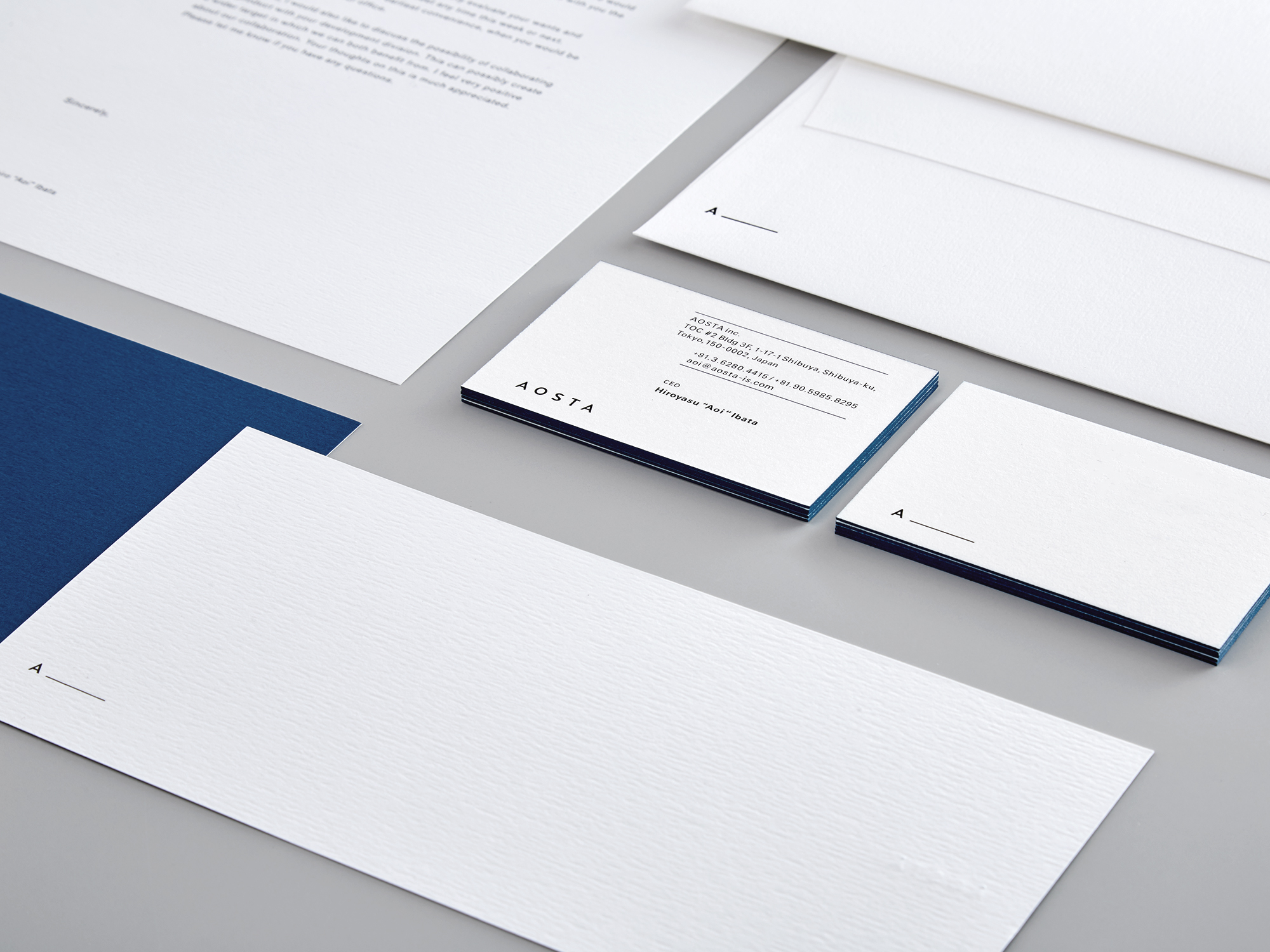
AOSTA is a manner consulting firm run by Hiroyasu “AOI” Ibata, which mainly consults on service manners for luxury brands, fashion brands, and hotels. He uses his experience as a model and incorporate posture, attitude and manner into his consulting techniques.
Regarding the identity:
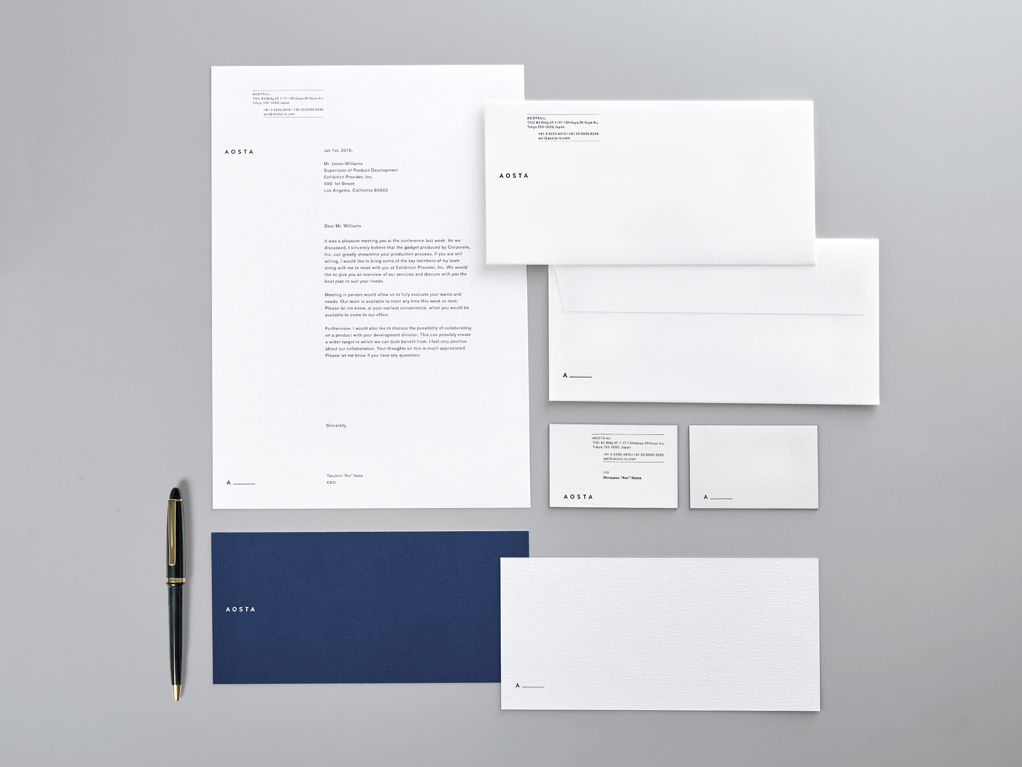
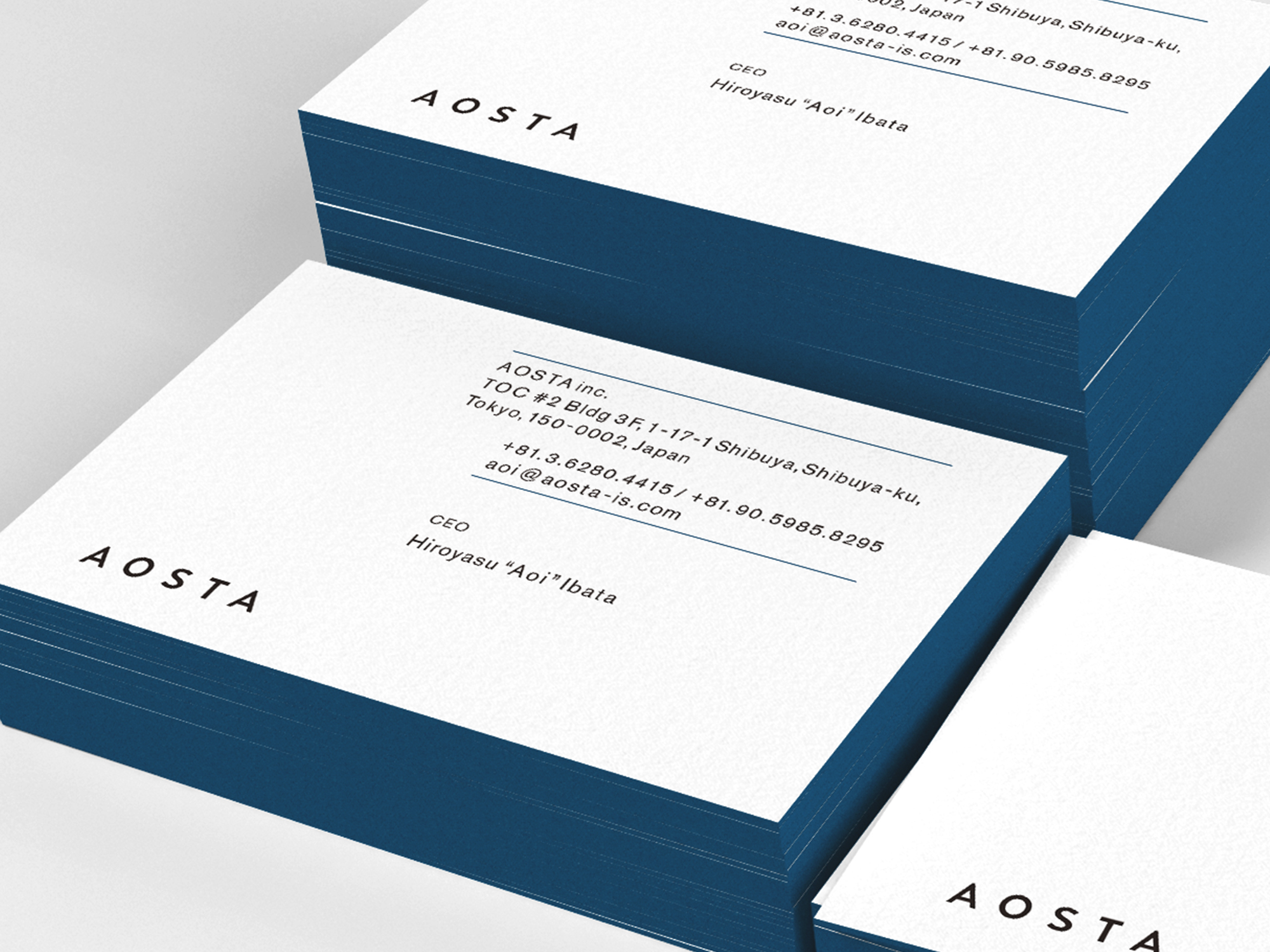
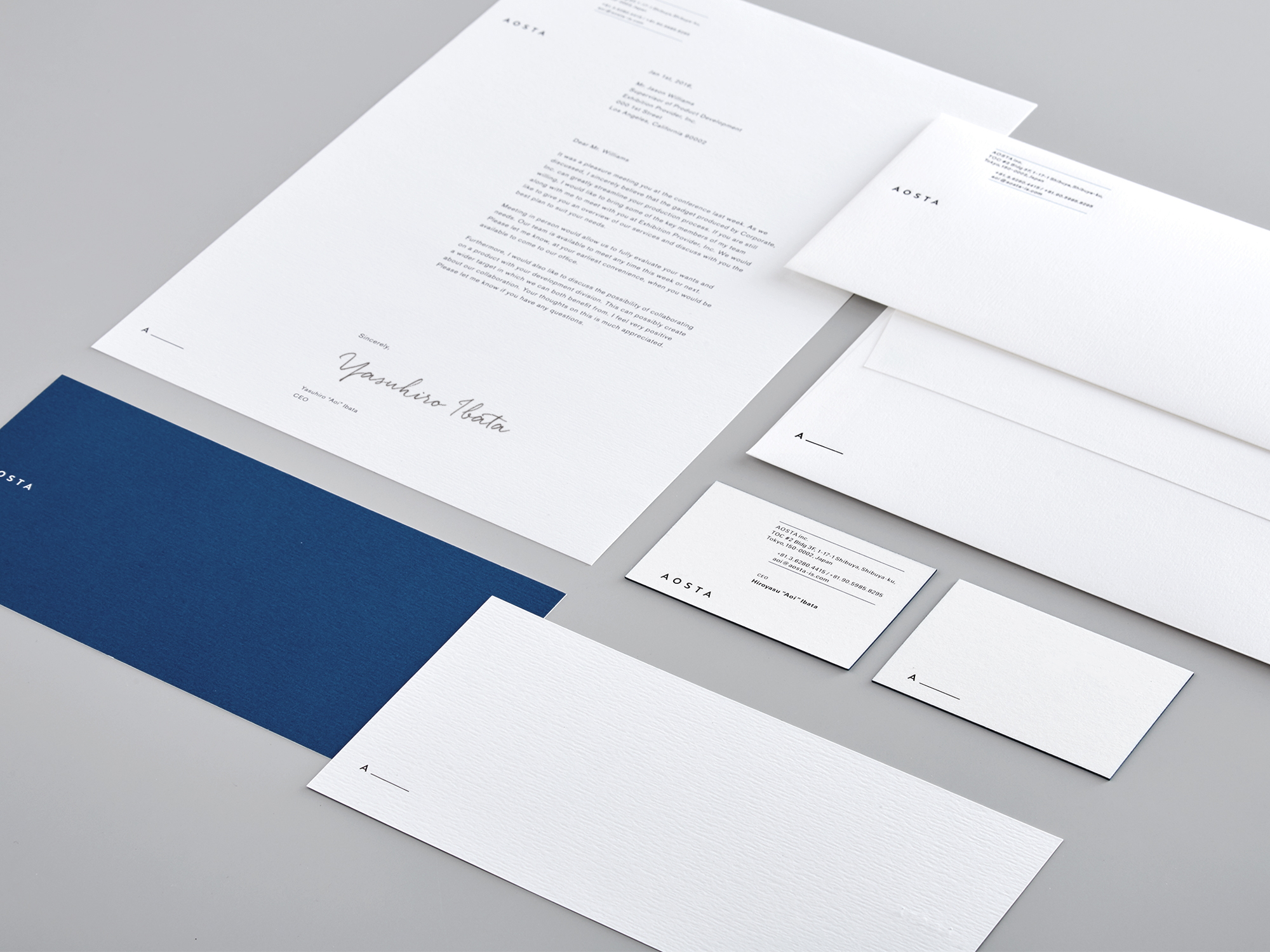
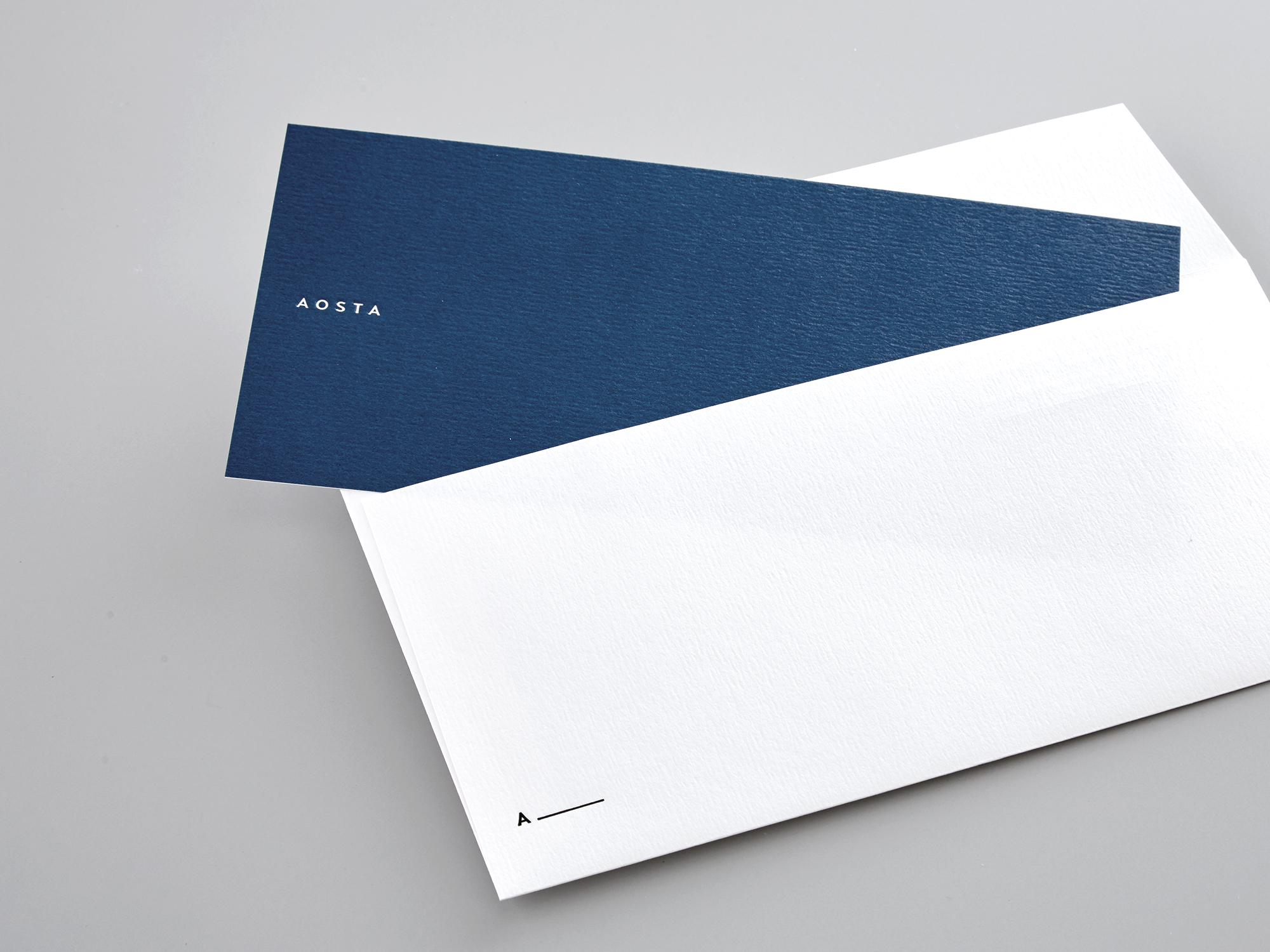
There is a word in Japanese “AO” within “AOSTA”, which means the colour blue, which inspired me to use midnight blue in to the identity. And then applied the colour black and white to give an impression of masculine yet noble gentlemen.
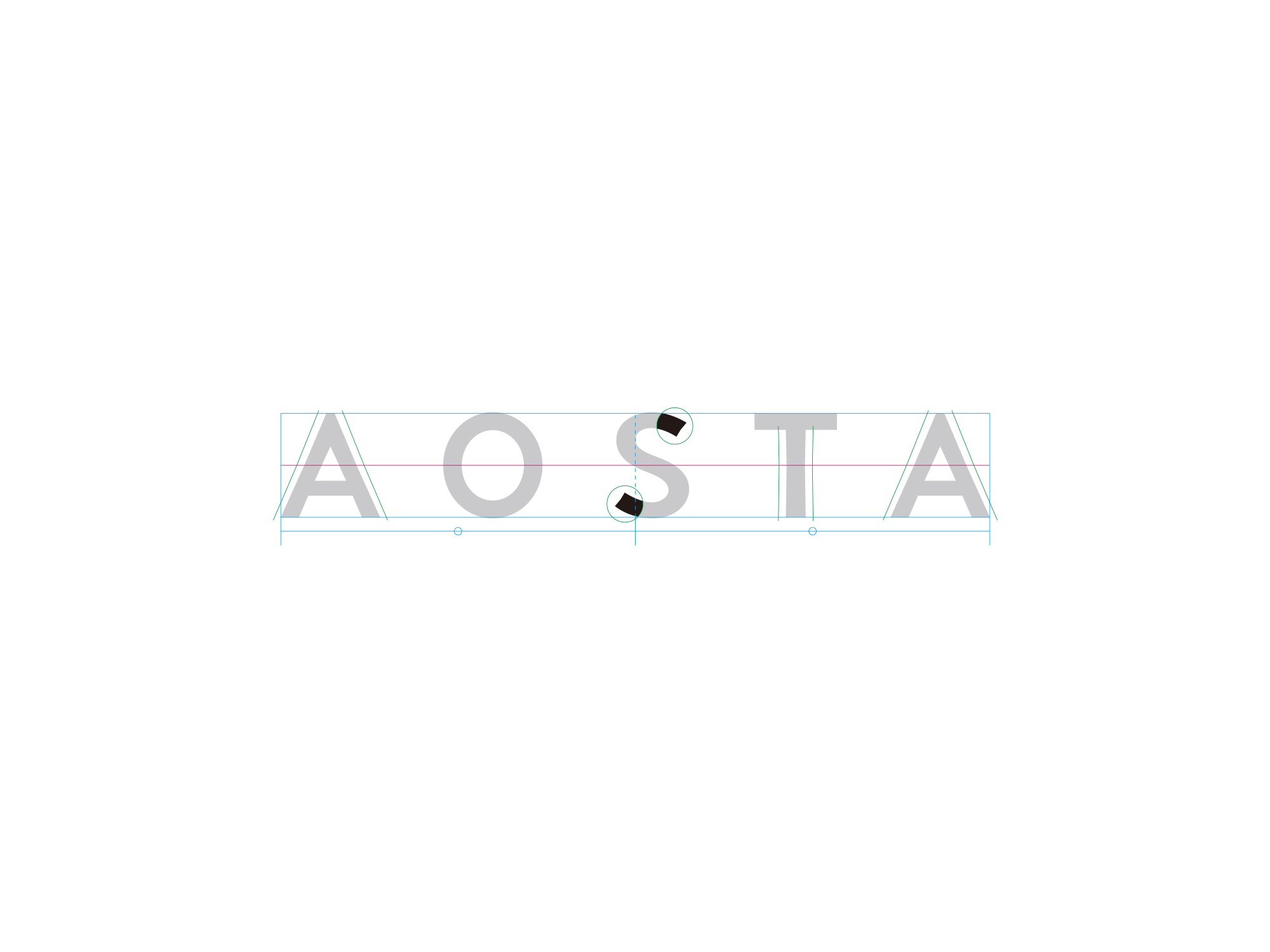
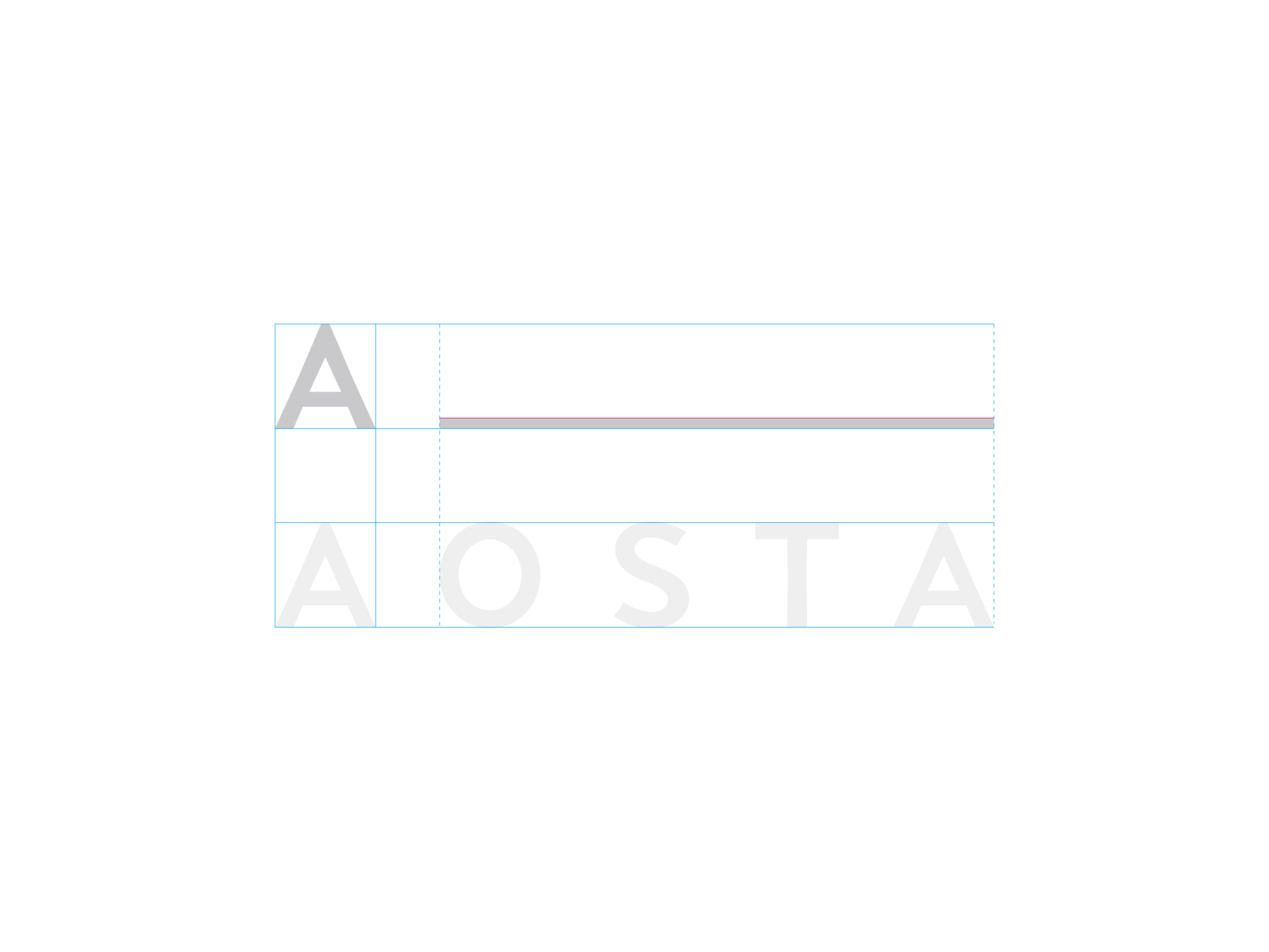
AOSTA’s fundamental concept, “manner begins from the right attitude” leads to a symmetrical shape, giving the logotype stability.
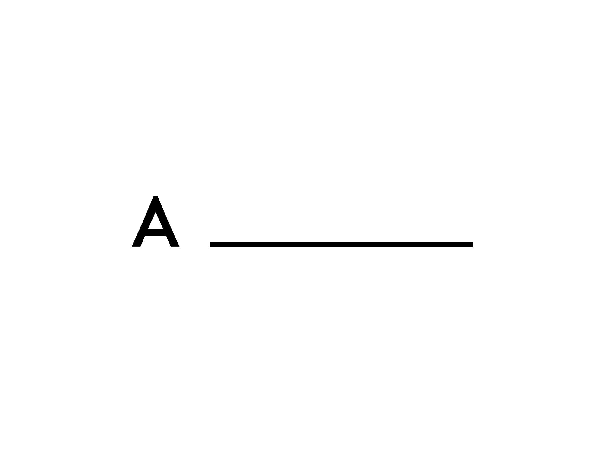
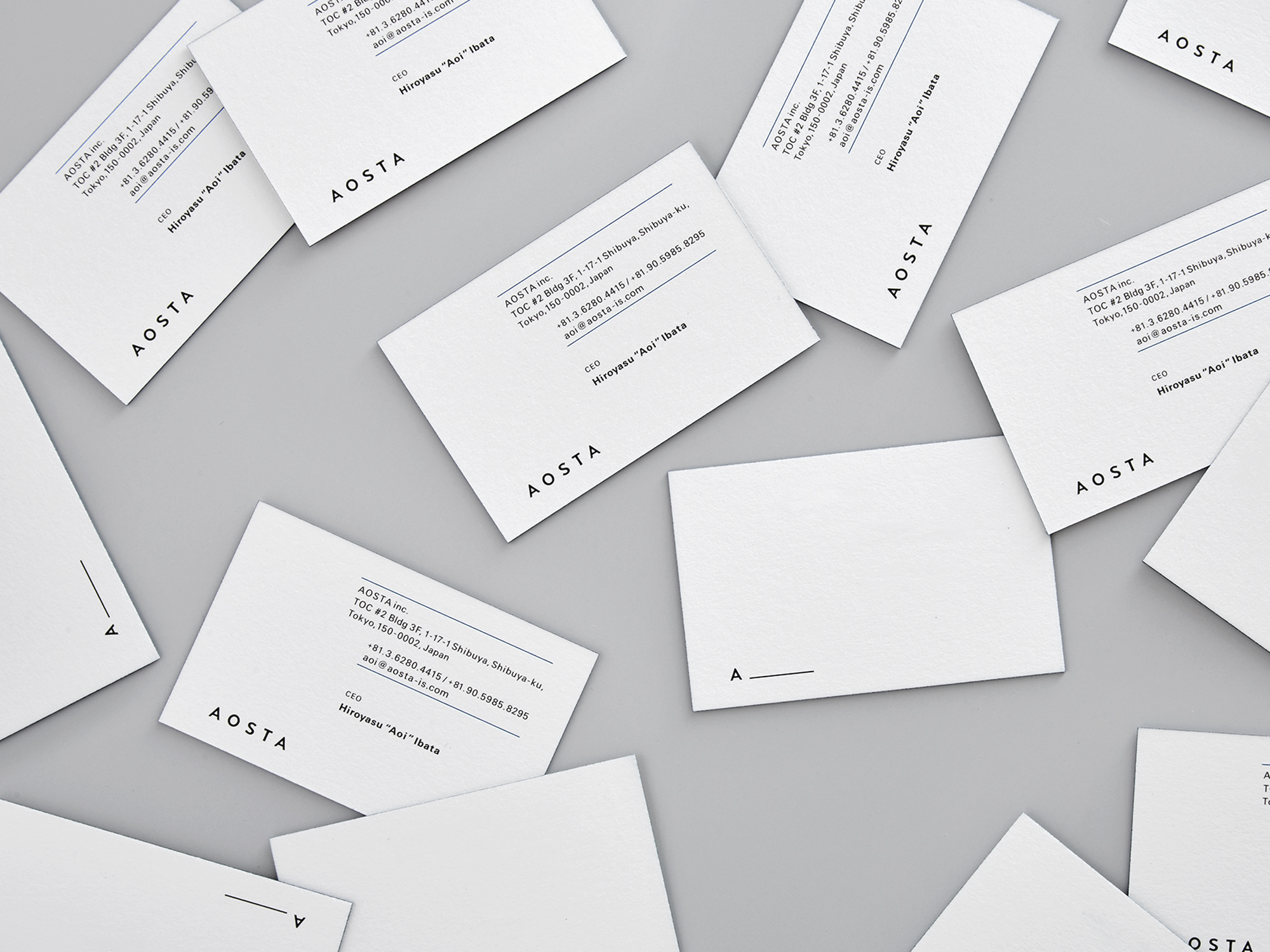
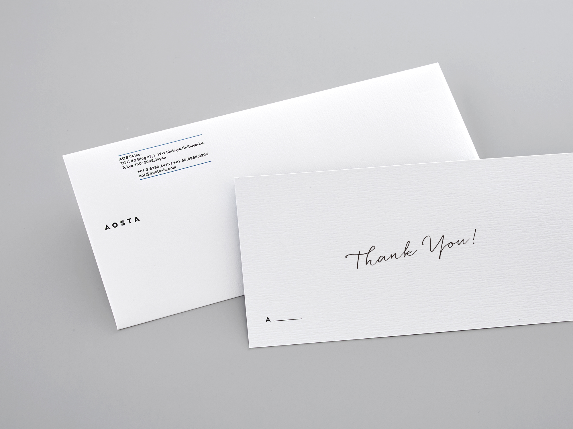
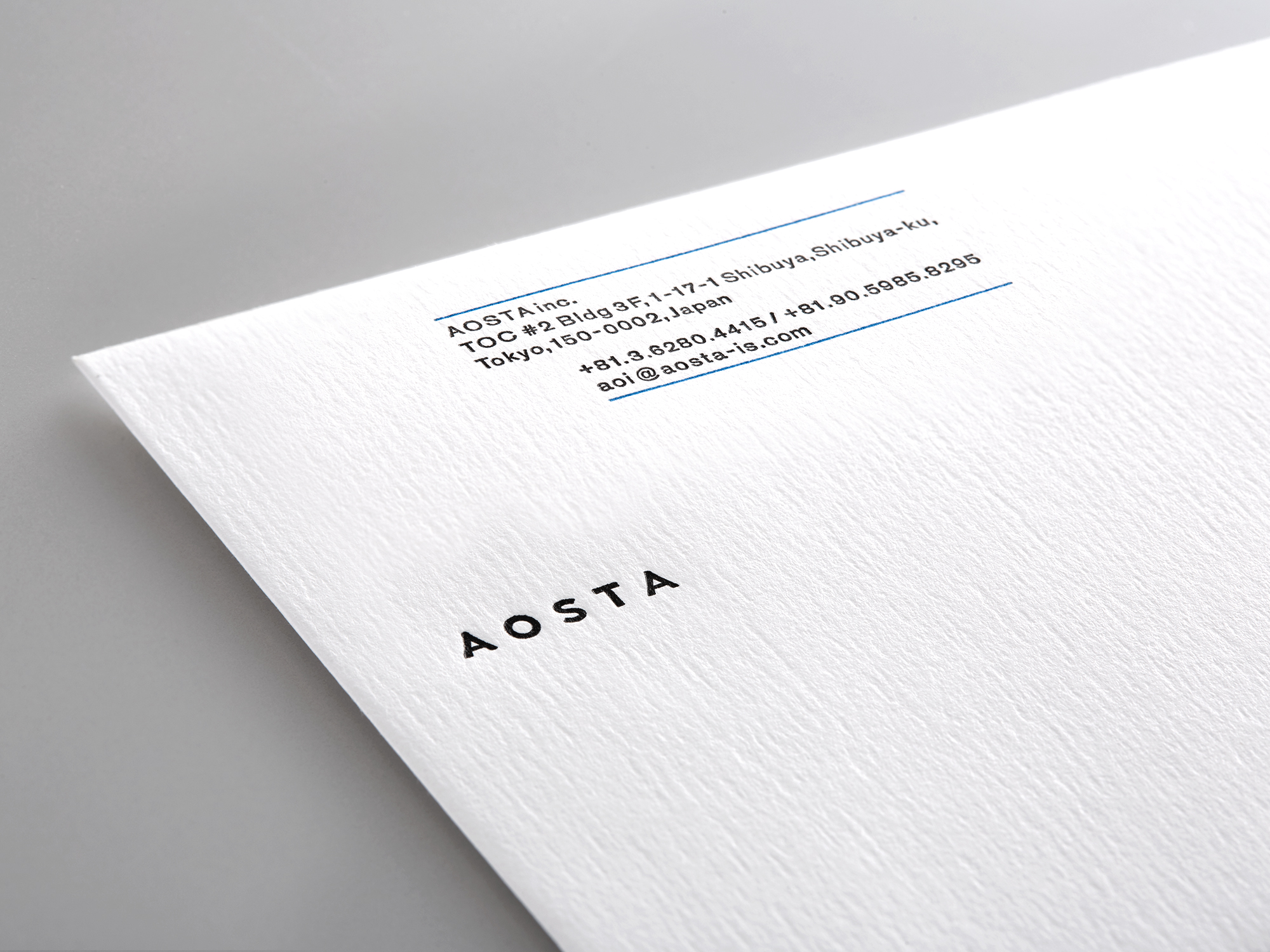
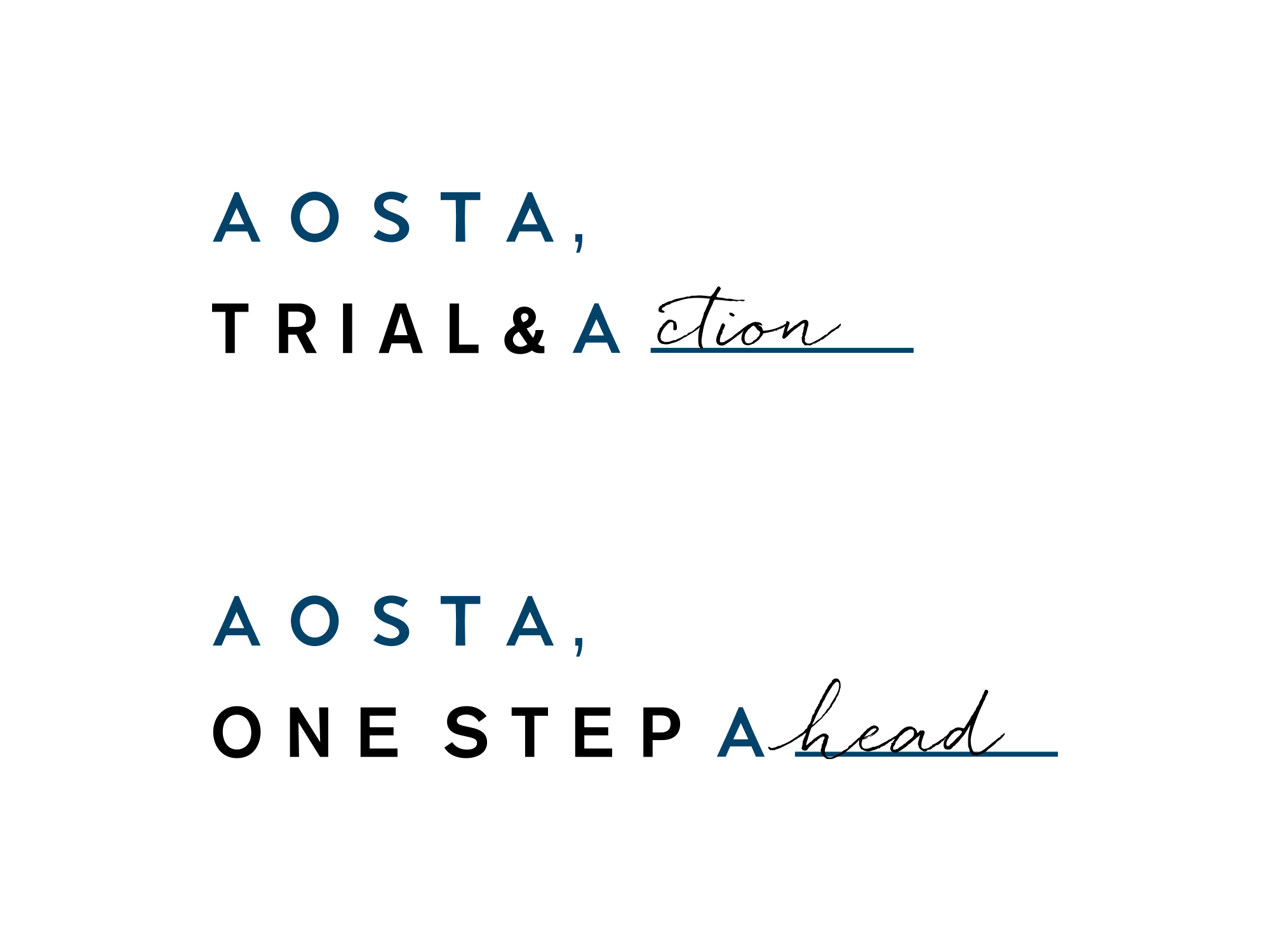
The logo is composed of the letter A and an under bar which is the same length as the “OSTA” in “AOSTA”. A____ is a mark representing the letter A, which is the begging of everything, which also expresses the brand concept.
Furthermore, this logomark can be used as a communication tool. For example you can use it on a message card with the message A”ction”, or on a back of a business card with the message A”rigato”.
–
AOSTAは、Hiroyasu “AOI” Ibataが運営するマナーコンサルティング会社である。主にラグジュアリーブランドからファッションブランド、ホテルまで幅広く接客業やサービス業におけるマナーコンサルティングを行っている。
代表のHiroyasu “AOI” Ibata自身のモデル業の経験を活かし、独自の視点から”姿勢”や”所作”の観点からアプローチするマナー指導で他社との差別化を図っている。
アイデンティティは、プライマリーカラーにAOSTAの中に含まれる日本語で”AO”(青)から着想したミッドナイトブルー。そしてホワイト、ブラックという3色で男性的でありながら紳士的で高貴なイメージを与えるカラーで構成した。
AOSTAの”正しい姿勢”からマナーは始まるというコンセプトからロゴタイプは、シンメトリーで末広がりの台形をイメージさせる安定感のあるロゴタイプを開発した。
また、ロゴマークは、AOSTAの頭文字の”A”と’OSTA”と均等な幅のアンダーバーで構成されている。
A_は、すべての始まりである”A”をマーク化することでブランドコンセプトを体現している。
さらに、ロゴマークの展開性として、A”ction”などといった企業メッセージの発信の手助けやビジネスカードの裏面に日本語でありがとうというメッセージをローマ字表記A”rigato”と書くことができるなどコミュニケーションツールとしても機能させることが可能である。
Art Direction & Desgin - Taiki Kato